

Project Overview
Design an app that allows users to organize their shows & movies from all streaming services into one organized easy-to-use platform.
Client: Graham Reid
Role: UX Research & UI Design, Branding
Client Requirements
Must include all Shows & Movies
Allow users to Create Movie playlists
Must allow for Reviews and Personal Profile
Research
User Survey & Interview - Results
Target audience: People between ages of 25-35
Most common app used — Netflix
People generally go on every app to find a show
Learn about shows through social media/family
Overwhelming support for one device
People would create multiple lists

Persona
Upon the results of user surveys & interviews, I created the persona. Hannah Jacobs. Below is her info, wants, needs and frustrations.

Journey Map
In conjunction with the persona, it was important to understand a user’s journey as they experience trying to find something to watch. We have all had similar experiences of wanting to watch something but not knowing where to start. Below is how Sean experiences this process.

Competitive Analysis
There were two apps that were close competitors to Watchlist, Trakt & TV Time. Both were analyzed and evaluated before developing Watchlist to understand what worked and what did not.

Iterative Process
User Flow
Before I began sketching anything, I wanted to understand how a user might find something to watch on the app. The flow below is an initial phase how I imagined a user might find what they are looking for.

Sketches & Wireframes

After quickly planning and sketching iterations, I began creating wireframes based on the research above.

Brand Design
With the extensive research of entertainment apps and creative imagery, I began to focus the brand direction with a dark, futuristic approach. I wanted the user to still feel that “theater” element but not overwhelm them with too much additional color than what would already exist with the show & movie posters. Color story remained simple, neutral with a pop of color.

Pre-Testing Iterations
Before I began intense user-testing, I wanted to fully render the app so I could better understand the feedback of users. With such a visually focused app I wanted to make sure user’s understood where the content would land.

User Testing Feedback
After multiple user-testing, I narrowed down feedback into specific responses to each user flow tested. Below are some of the comments made.

Overall, feedback was positive with a few adjustments needed in the list below.
Overall good feedback on interface
Need to improve color/contrast
Simpler overlays/pop ups to communicate to user
A lot of info compact in one space
Changes
Upon additional user testing, I adjusted quite a few details on each of the screens. See below for before and after adjustments.

Final Design
Watchlist Flow
Below is the flow from the search page to adding a movie to the watchlist.

Review Flow
This flow showcases how the user might add a review.

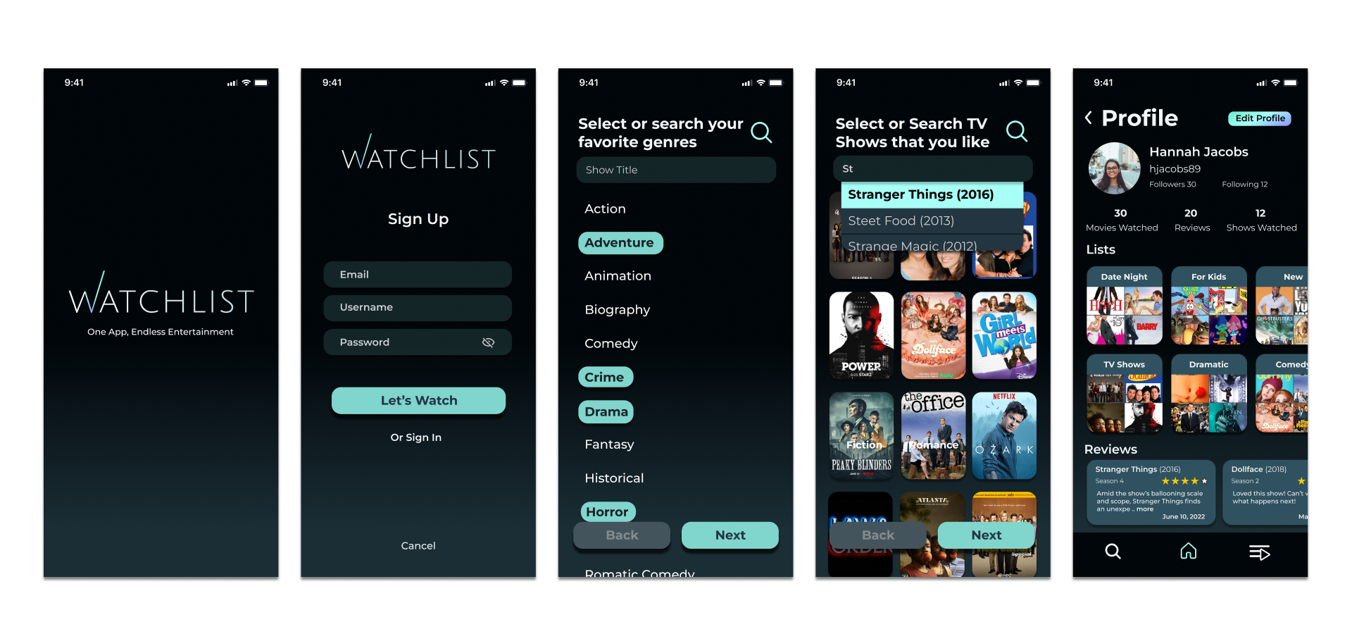
Onboarding & User Info
Below is the flow from the opening screen to the onboarding screen as well as the profile screen of the app.
Prototype
Findings
This app design was such a fun project to work on. I found some great learnings based on all the extensive user-testing. Below are some of the key findings.
Utilize interface users are familiar with - (ie. Netflix & Hulu)
Heavy visual aspect, to remain simple - Don’t overwhelm user
Has potential to become even more of a “social” app with current feedback - Users wanted to potentially share comments within the app about movies/shows they loved.