


Summary
Millions of people across the globe own a pet, but what happens when they travel? Who’s taking care of their little critters? Most importantly, how do we communicate our pet’s needs? With the creation of MyPet, pet owners can easily store and send their pet’s info to their most trusted caretakers.

Role
UX Researh
UI Design
Branding
Problem
Design a digital app & database that contains a pet’s info and creates an easy way to deliver information to their sitter or care taker.
Research
My extensive research is presented below. Throughout this process, it was key to understand what information was important to include within the app so that the user could accomplish their goals and for their pet’s to be happy!
User Survey/Interviews
Top Findings
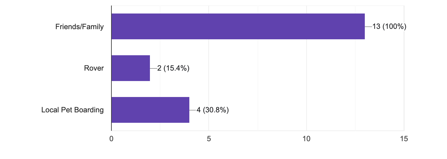
Users rely on friends/family
Users travel 1-3x year
Prefer instruction list or guide via text
Focus on routine & behavioral information
What services have you used for pet sitting?
Persona

Customer Journey

Customer Analysis (SWOT)

Iterations
With the compiled research, I began to sketch into ideas. After many iterations, I moved into some basic wireframes to build out the screens.
Pet Profile Iteration
Wireframes
Sketches

Data Entry Iteration
Wireframes
Sketches

Branding
Like we see our pets, I wanted MyPet to feel fun and playful. Keeping it colorful was a key factor in my design decision. I also knew that color could help me organize my information into various categories.

User Testing Results
Upon completion of my first rendered prototype, I began my first set of user testing. Below are some of the pain points and feedback.
Users confused by onboarding
Adding “pet-sitters nearby”
Loved color & playfulness
User wanted to see how text/email would be sent to sitter
User wanted to understand better how you could edit after onboarding
Adjustments
Onboarding
After
Before

Color-coded modules allowed for communication to be understood
Smaller indicators & “swipe” added
Users were confused
Indicator of screens was too big
Pet Profile
Before
After

Users could tap bubble to see specific modules of data
Users can see more info on screen
Too much unused space
Users just wanted to see all data
Final Prototype
Taking the user’s feedback into consideration, I finally landed on a final prototype that felt clear and easy for any pet owner to use. And of course, make sure that user could send their sitter all the information they needed to take care of their little critter.
Conclusion
People were excited about this app
Could potentially go further to be a sitter app
Would be nice to have vet interaction within the app for users
Learnings
Don’t over design - Keep using similar elements
Pay attention to color usage, use in ways that can help organize data
Small animations make for fun usage
*Designed for Thinkful Capstone Project